
Why Color?

We recently designed a pair of affordable residential buildings in the Bronx for Catholic Charities. A senior director there who was our day-to-day contact, Drew Kiriazides, was a highly educated, empathetic and thoughtful man who dedicated his all-too-short life to make the City a measurably better place for its citizens and neighborhoods. I admired him greatly. During the design process, we had many fascinating and unexpected conversations about urbanism and design, and the assumptions we make about poverty, assumptions Drew was always questioning.
My most memorable of our talks, surprisingly, was about color. Up until then, our building exteriors integrated color into the facades, with accent panels, glazed brick, or graphics. Sometimes there would be more than one color or material in contrast with the overall background, creating a polychromatic mosaic meant to delight the eye in an otherwise gray urban landscape.
Why color? Well, for me at least two reasons. My earlier background as a visual artist always skewed me towards color. Later, as an architect, color became an inexpensive path towards vibrancy. Or even happiness. Blue cost the same as gray. Our under-funded non-profit clients embraced the notion. It became a hallmark.
But back to Drew. When we presented our colorful facade options, he was pensive for quite a long time. And then he finally asked, politely, “Why color?” What is it with you architects? So much color everywhere!! I was stunned. How could anyone be opposed to color anywhere, anytime? What?
He goes on to explain. Wandering through New York's poorest neighborhoods, they are awash in buildings with blue, orange and yellow panels, materials, canopies, graphics and entries. One building has more than the next. But try walking down Madison Avenue, or a more monied part of chic Brooklyn. A colorful accent panel is nowhere in sight. The buildings are clad in low-luster materials of creams, grays and bronze, waiting for Calvin Klein or Hugo Boss to move in. Color be gone!!
So then what is our culture saying here, manifested through the well-intentioned hands of us urban architects? Why bright colors for low-income families and subtle beige tones for the wealthy, like well-curated symbols of an understated privilege and taste? Is there some unspoken or unconscious need to cheer people up as they approach their subsidized rental, looking up towards our gorgeous rainbows and think, “Maybe life's not so bad after all, when there's so much color in the World!”, as we remain oblivious to the unintended condescension.
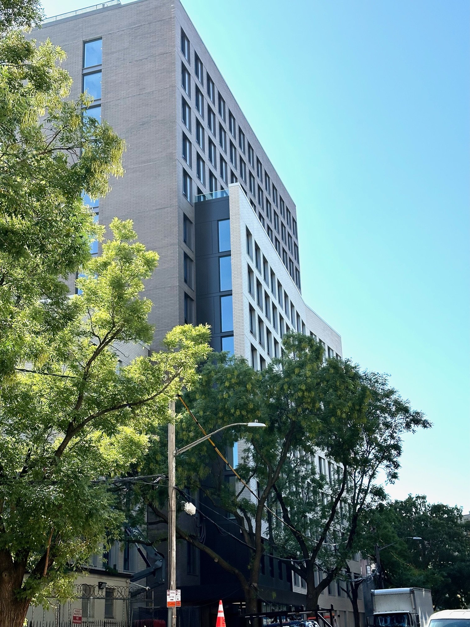
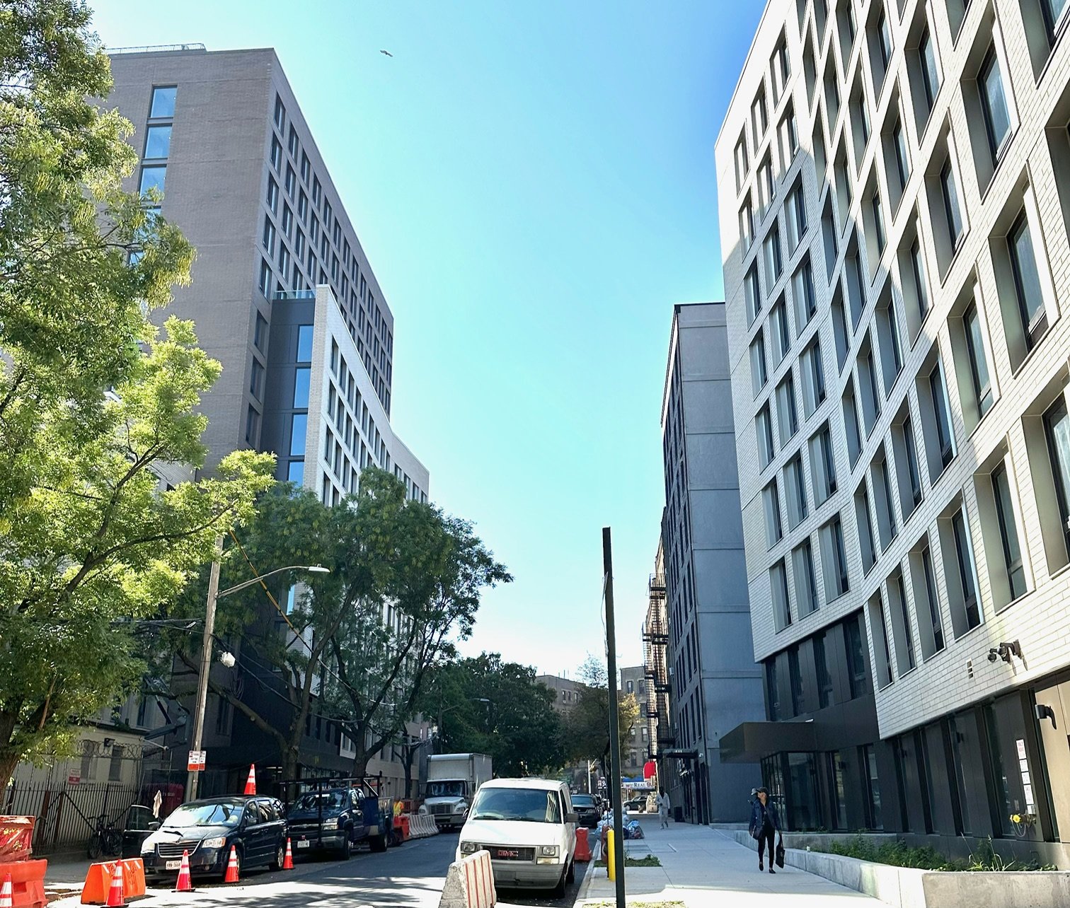
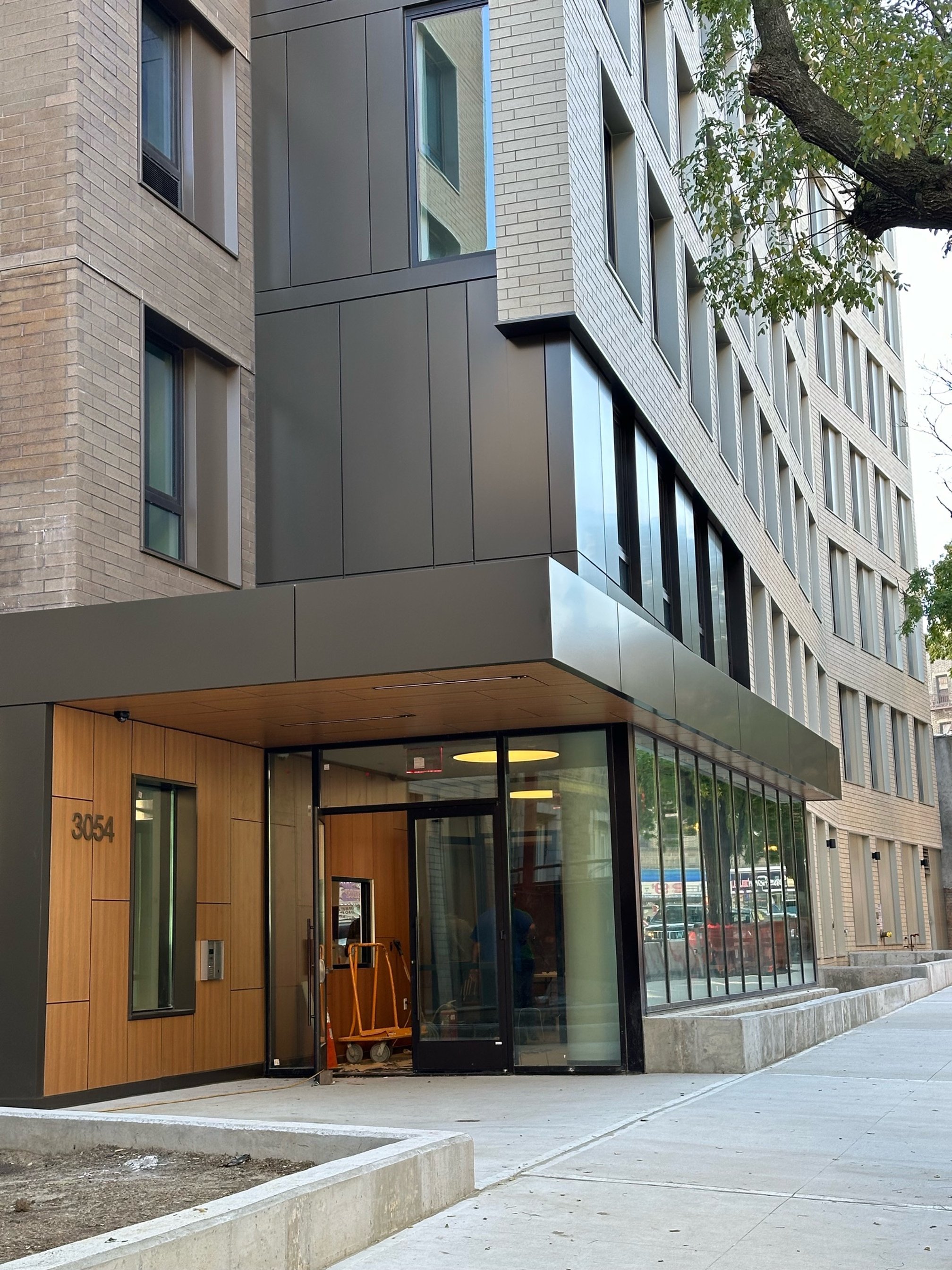
I felt an inner shift, and we returned with facade designs devoid of bright colors, instead relying on the natural tones of brick, metals and woods. The subject matter became about form and proportion, and different ways light and shadow affected these surfaces - late afternoon sun bathing a beautifully textured brick as the surface glowed into dusk. Only at the main entry did we bring in a welcoming wood wall, a very special moment of color. Once.
Classic, muted elegance for everyone, working well with the existing urban fabric, not contradicting it. For the same price. We still use color, of course, in our design work, but I have never thought about poverty and color in the same way since then.
In gratitude to my friend and colleague Drew Kiriazides, and his never-ending questioning, this essay is dedicated to his memory.