My Pandemic Silver Lining


Lisette Wong
Permalink

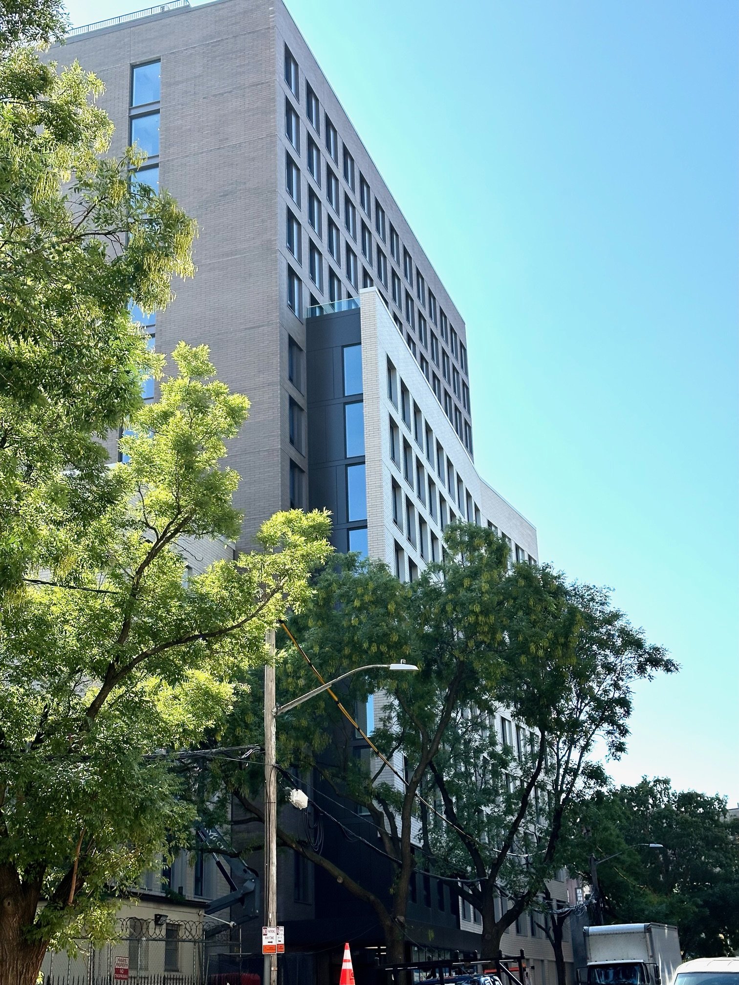
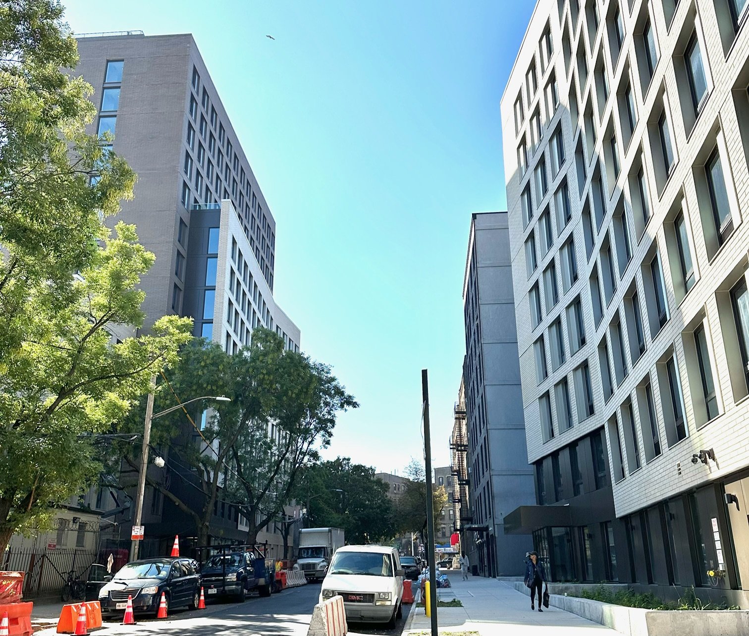
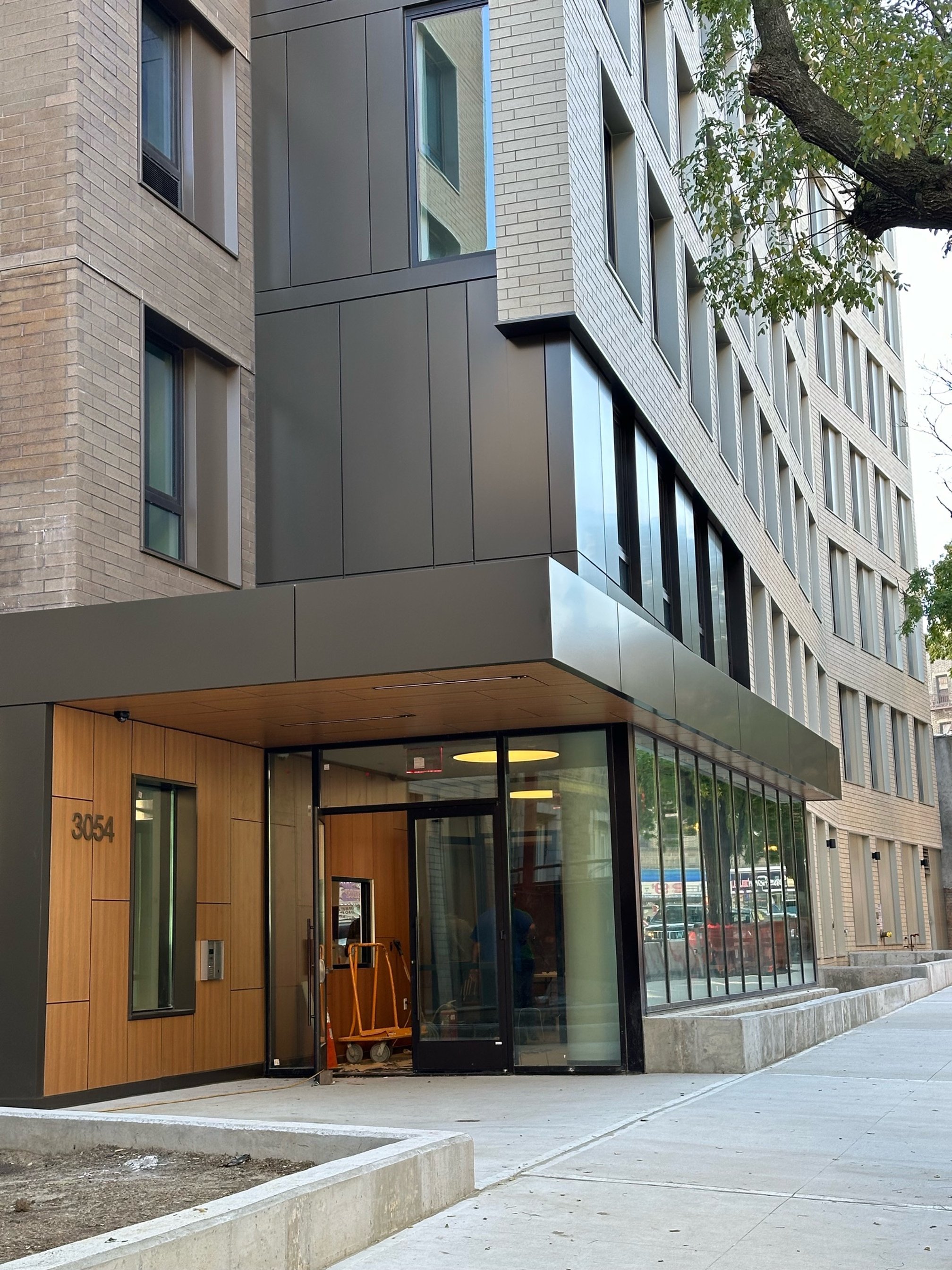
During the pandemic, my personal reboot was to step back and reassess; what came into focus were two concerns, lack of sufficient affordable housing and global warming, this notwithstanding, is the reason why I work at Think! Architecture, which is at the forefront of both concerns.

As time marches on and the end of the Pandemic recedes into the rear view mirror; its effects linger on, one single event having effectively reshaped our society; we collectively underwent an instantaneous shift from in person in the office as we once knew it, to making Star Trek communications a reality, beaming in remotely from our private homes through a computer screen, conflating our personal and work spaces, effectively redefining how we inhabit our urban, suburban, and rural landscapes.

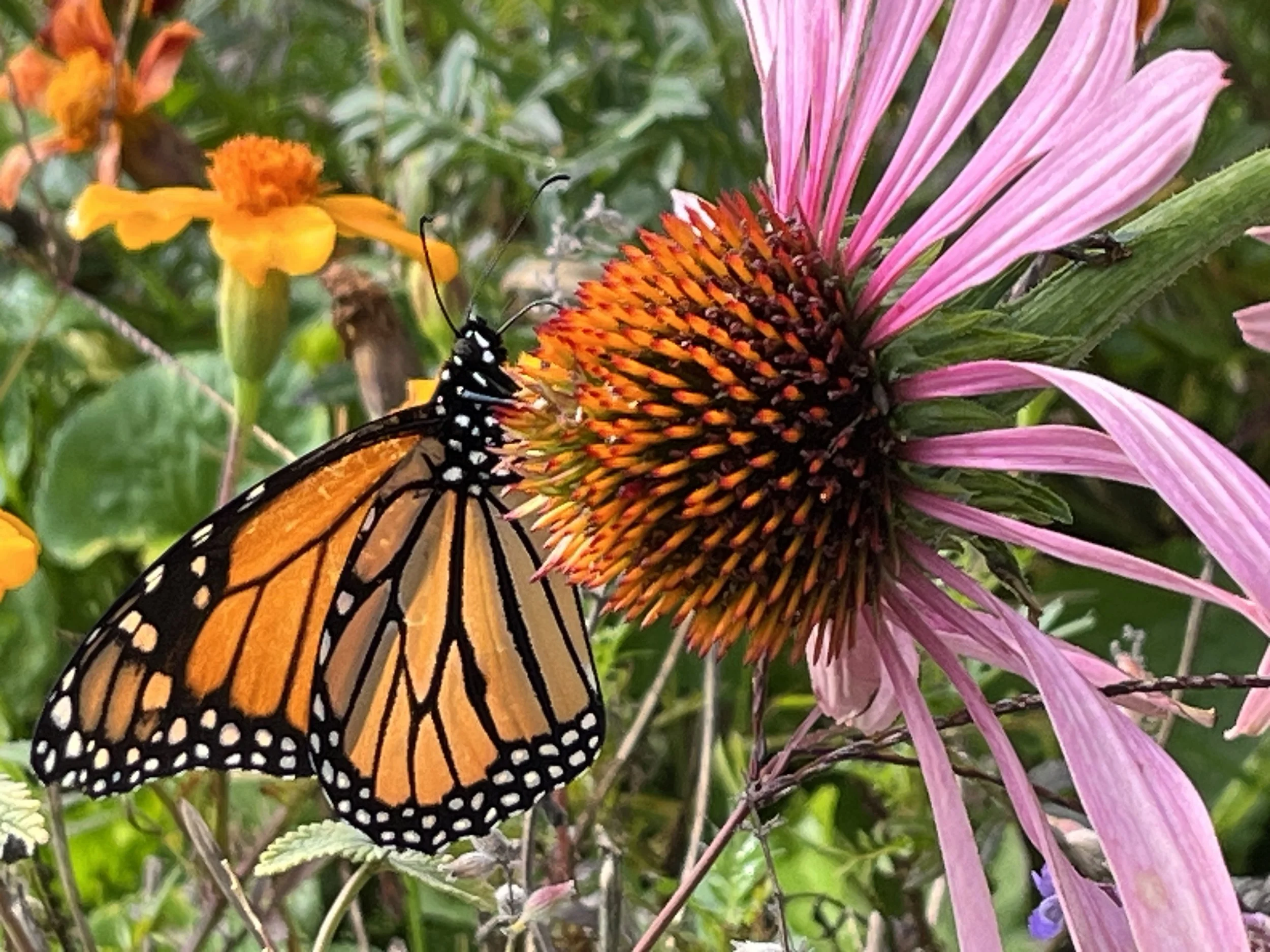
Amidst these circumstances, it allowed me a time to slow down and re-assess, in a split screen scenario, the quotidian rhythm of remote work to a backdrop in a rural landscape.  Fortunate to have a corner to hunker down in the countryside, I took refuge amidst fields, trees, and the open sky above me, in stark contrast to my life in the urban setting of New York City.  Like many, I felt an urge to re-plant the vegetable garden I had once abandoned to the weeds and neglect; this underscored for me the ease in our industrial society and instant access to abundant food. Each day, I would repeat the rounds and care for my vegetable patch, trees, and perennial gardens like my own children watching them grow and change each day, learning firsthand about their dependency on the natural landscape and climate.

Within this frame of mind and coddled by an idyllic rural landscape, two concerns surfaced to the top, climate urgency and lack of sufficient affordable housing. I realized that I wanted to shift my focus within architecture. I believe that change can occur if we each one by one contribute, this cumulative effort will create change.

So, thrilled to have the time to cull the resources my local library offered; I drew incredible inspiration from early advocates and thought leaders of sustainability, Amory Lovins of the Rocky Mountain Institute (RMI) who understands that sustainability must be indelibly tied into market economy and be profitable and William McDonough, nicknamed the "father of the circular economy" who promotes the idea of shifting our idea of creating products to end up as waste to reusing, recycling, reducing, repairing, refurbishing, re-purposing, re-manufacturing, and recovering materials to cycle back into the economy, known as ‘Cradle to Cradle’.

In order to leave a world environmentally intact for the next generation, our children and their children, we must reverse global warming.  We cannot reverse back to an agrarian society; we must re-shape our technological society and global economy by reducing our contribution to greenhouse gasses through the goal of carbon neutrality.  

As an architect, I’ve been drawn to organizations at the forefront of leadership in environmental advocacy and I obtained certifications from LEED, a holistic approach to sustainability, and Passive House (Phius), a construction methodology to create durable, resilient and low carbon buildings, methods that contribute towards building industry standards that move the needle in our stewardship of our world.

Each step counts.

Why Color?


Jack Esterson
Permalink

We recently designed a pair of affordable residential buildings in the Bronx for Catholic Charities. A senior director there who was our day-to-day contact, Drew Kiriazides, was a highly educated, empathetic and thoughtful man who dedicated his all-too-short life to make the City a measurably better place for its citizens and neighborhoods. I admired him greatly. During the design process, we had many fascinating and unexpected conversations about urbanism and design, and the assumptions we make about poverty, assumptions Drew was always questioning.

My most memorable of our talks, surprisingly, was about color. Up until then, our building exteriors integrated color into the facades, with accent panels, glazed brick, or graphics. Sometimes there would be more than one color or material in contrast with the overall background, creating a polychromatic mosaic meant to delight the eye in an otherwise gray urban landscape.

Why color? Well, for me at least two reasons. My earlier background as a visual artist always skewed me towards color. Later, as an architect, color became an inexpensive path towards vibrancy. Or even happiness. Blue cost the same as gray. Our under-funded non-profit clients embraced the notion. It became a hallmark.

But back to Drew. When we presented our colorful facade options, he was pensive for quite a long time. And then he finally asked, politely, “Why color?” What is it with you architects? So much color everywhere!! I was stunned. How could anyone be opposed to color anywhere, anytime? What?

He goes on to explain. Wandering through New York's poorest neighborhoods, they are awash in buildings with blue, orange and yellow panels, materials, canopies, graphics and entries. One building has more than the next. But try walking down Madison Avenue, or a more monied part of chic Brooklyn. A colorful accent panel is nowhere in sight. The buildings are clad in low-luster materials of creams, grays and bronze, waiting for Calvin Klein or Hugo Boss to move in. Color be gone!!

So then what is our culture saying here, manifested through the well-intentioned hands of us urban architects? Why bright colors for low-income families and subtle beige tones for the wealthy, like well-curated symbols of an understated privilege and taste? Is there some unspoken or unconscious need to cheer people up as they approach their subsidized rental, looking up towards our gorgeous rainbows and think, “Maybe life's not so bad after all, when there's so much color in the World!”, as we remain oblivious to the unintended condescension.

I felt an inner shift, and we returned with facade designs devoid of bright colors, instead relying on the natural tones of brick, metals and woods. The subject matter became about form and proportion, and different ways light and shadow affected these surfaces - late afternoon sun bathing a beautifully textured brick as the surface glowed into dusk. Only at the main entry did we bring in a welcoming wood wall, a very special moment of color. Once.

Classic, muted elegance for everyone, working well with the existing urban fabric, not contradicting it. For the same price. We still use color, of course, in our design work, but I have never thought about poverty and color in the same way since then.

In gratitude to my friend and colleague Drew Kiriazides, and his never-ending questioning, this essay is dedicated to his memory.

Blue Buildings


Jack Esterson
Permalink

I’ve noticed something going on in our hometown, New York City, for some time, and I'm going to call it the blue building syndrome. The buildings are not really blue, but they look blue, a very light cool blue, they are huge and they are going up all over town. They are sleek, minimalist, elegant, expensive and rather bland. They are the default setting today for large-scale commercial development by the largest developers around. And the big architecture firms are falling in line producing them, including such distinctive names as Diller Scofidio & Renfro and Fumihiko Maki.. Go down to the re-built World Trade Center or to Hudson Yards. Its as if someone designed the perfect glass curtain wall system and everyone agreed its the thing to do, which leaves only the building shape as the variable - with their straight lines, or tapered walls, or curves, or even tilting towards collapse. The blue-ness comes from the glass reflectivity, and the walls blend into the sky in a way that makes them almost disappear, as if apologizing for existing. They take on an ephemeral quality, and a lightness that is somehow pleasing and stultifying at the same time. I would say that it began right after the attacks of 911.

Blue Building_Jack Esterson (1).jpg

Maybe this is OK. If one looks at old photos of the Lower Manhattan skyline in the 1940s, its a marvelous sprouting of consistent limestone spires. I think its the consistency of tone and the impossibly narrow towers that made it so breathtaking, and unlike anything that came before. So maybe vast clusters of the new blue buildings will be like an eruption of quartz crystals, a new glazed version of that old Lower Manhattan. Or maybe not, if the next thing will come to be before such a thing can ever materialize to critical mass.

Beautiful Freeways


Jack Esterson
Permalink

Last year I was driving through Los Angeles with friends. I live in New York City, and don’t own a car, but have always been intrigued by LA car culture, and how it has shaped the city. I never really thought much about their freeway system except for the legendary horror stories of 12 lanes of bumper to bumper standstill traffic, featured so often in movies. But after years of taking New York’s highways, I realized how beautiful they can be in LA.  Why is that? Why so lovely? A freeway lovely?

19DFE5B8-84FF-44AD-BEE0-7BDD16277873@columbus.rr.com.jpeg

The grandeur of these poured concrete curving structures seems to celebrate the very idea of mobility, and their utter simplicity and power of form strike me as something Le Corbusier might have designed, or derived from some great temple at Luxor. While New York celebrates commerce though the invention of the skyscraper, beautiful spires marking the city like mediaeval churches, our highways seems to be a complicated tangle of steel, concrete and bad signage. They are a means from point A to B but hardly enjoyable to be on and one can’t wait to get off, and back into the civilized City. They are in opposition to New York, while in LA they are of the city. 

3CD8A105-E63F-420A-8632-0FF245027330@columbus.rr.com.jpeg
F9E02529-D389-4E9B-941E-F17349098287@columbus.rr.com.jpeg

I wonder why these freeways in LA appear so lyrical to me. Maybe it’s because the city is so much about the automobile, and when a city inhabits an idea so fully, the design it manifests is inevitably compelling.  Or did enlightened engineers take over at the local transportation department there at some point, or a mandate came from up high about how pure engineering equals beauty, or something? Or was it a larger idea of modernity or the zeitgeist of the 20th century metropolis that took hold when these roads were built? They are so compelling that the architecture firm Coop Himmelblau designed a high school hard by the Hollywood Freeway that looks to me to be homage to the freeway system. It seems that only in LA would that ever happen.

BAFA6AC3-F41D-4B12-98CD-F83C8E1B0A6A@columbus.rr.com.jpeg

Affordable Style


Jack Esterson
Permalink

New York City is awash in new residential building projects known as Affordable Housing, driven by Mayor De Blasio's push for 200,000 new or preserved affordable apartments and the need for middle class and lower income people to remain in the City. Architecture firms in NYC are building entire practices around this mandate. For years, actually, large swaths of the Bronx and Brooklyn are being rebuilt with new, publically financed structures. Due to various forces having to do with finances, regulations and a shear lack of imagination, these buildings blend together into a bland, predictable housing stock that adds little to the local community except for clean and decent places to live, no small task.

Picture2.png

But I ask, why does New York’s affordable housing have to look “affordable”? The attributes of this “style” are typical – the cheaper “jumbo” red brick, the horizontal stripes of contrasting brick, and the same relentless under-scaled windows. It has a mean-spirited look and its everywhere. It is creating a city of no character, no identity except an identity of scarcity.

IMG_5216.jpg

I believe everyone deserves inspired and innovative design and it’s our job as architects to test the limits of what can be done in this building type. Otherwise we are conveying the message that lower income people don’t really matter, and neighborhoods in outlying areas don’t matter either, and they do. With some ingenuity, thoughtfulness, and most of all, empathy, we can raise the bar of affordable housing design significantly, as it is in many other parts of the country and the world. Being in the midst of this building type now, we at think! understand how hard it is to negotiate innovation and quality within the confines of public agencies and their demands to maximize unit count and minimize construction budgets, all within an over-heated construction market. We understand the pressure that puts on architects to produce the same predictable outcomes – the lowest common denominator. But we can’t settle for that. We have to do better. Achieving quality and innovation in affordable housing is really hard – but is not a factor of high budgets. It’s a matter of imagination. And that's our job.

A Behemouth on 125th Street


Martin Kapell
Permalink

I guess it’s a real no-no to criticize a colleague’s work, but sometimes a project is just so bad [and so emblematic of a prevalent developer attitude] that one really has no choice. This project, whose ground breaking was just announced in the NYC real estate cyber world, is a mixed use development at the site of the long languishing Victoria Theater on 125th Street in Harlem — on the same block as the Apollo. Its design, if it can actually be called that, seems to epitomize the “something is better than nothing” attitude that has done so much damage to the street over the years rendering it an anonymous “anywhere” rather than the bustling “somewhere”  it once was and, one can only hope, could still possibly be.

There are so many architects in New York who would have done an interesting building on this site that could have contributed to the renaissance of 125th Street as an important urban thoroughfare rather than the proposed extravaganza of pseudo-architecture that will do nothing but degrade what little is left of the street's architectural vibrancy. The building is a compendium of so-called architectural devices intended to give it character and to breakdown its ponderous scale. Ironically, they do just the opposite, creating a scaleless behemoth covered with gratuitous surface manipulations signifying nothing.

Clearly no building can be judged only on its own merits without considering its effects on the street, its neighbors and the city as a whole. Not only is this building an architectural monstrosity in and of itself, it is also a brutal insult to a once great street and a noble precinct of the city.

Are buildings and architecture synonymous?


Martin Kapell
Permalink

It has always been an interesting question for me as to whether a distinction can be made between buildings and architecture.  That is to say between structures that improve the world and those that only provide a function and just take up space. This is more than just a distinction between good architecture and bad, is no architecture better than bad architecture or pseudo architecture? Is Stuyvesant Town better than the awful buildings lining 4th Avenue in Brooklyn? Are there, in fact, buildings totally without architecture or does the very fact of building, particularly building something big, require a level of intention, decision making and choice that inevitably makes the built thing architectural?

Then I saw this photograph of a large group of buildings, perhaps an entire neighborhood in Pyongyang, North Korea, and the question was answered. This entire section of the city has been intensely developed, with tall buildings, and yet is totally devoid of architecture – this much is immediately clear, is it so different than the public housing projects of New York, Philadelphia, Chicago or any number of other cities? More difficult to understand, perhaps, is what it is that’s missing, the presence of which would make these structures more than just buildings.

Pyongyang, North Korea

Pyongyang, North Korea

If you didn’t know better, it would be easy to believe that the Pyongyang buildings are really some kind of ominous rendering of the set for some sort of apocalyptic sifi movie or a primitive Sim City-esque computer game run amuck – buildings sprouting and growing as the result of some mutant, metastasizing algorithm rather than a place for real people and real families to live.  Nothing differentiates one building from another or one use from another or one part of a building from another.  And, as horrifying as the skyline of these buildings might be, I can only imagine that the street level is even worse with endless blocks of undifferentiated streets.